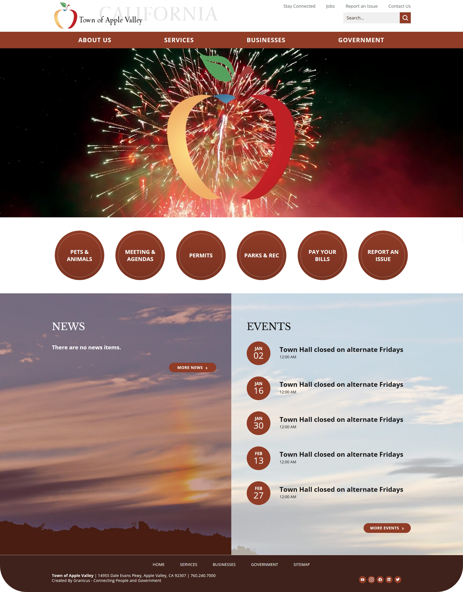
Town of Apple Valley Website Redesign
Led the redesign of the Town of Apple Valley’s municipal website, improving accessibility, usability, and long-term maintainability across a public-facing platform receiving more than 100,000 annual views.
The project included restructuring navigation, modernizing page layouts, improving accessibility standards, and transitioning the site from CivicPlus to WordPress—reducing annual platform costs by approximately $12,000 while creating a more flexible and scalable system.
My Role:
Lead Designer & Accessibility Specialist
Responsibilities:
Accessibility • U.X/.U.I. • Information Architecture • Compliance Strategy • Content Design
Deliverables:
- Accessibility Audit & Remediation
- U.X. Research & Content Architecture
- U.I. Design & Visual System
- WCAG 2.2 A.A. Compliance Verification
- Content Rewrite for Plain Language Act
- Department Templates & Editing Guidance
Average Annual Views
Annual Cost Savings
Department System Consistency
Accessibility-focused Redesign
WordPress Migration from CivicPlus
Out with the Old
The Town’s previous website had grown into a large public-facing system with inconsistent navigation, outdated page layouts, and department content that was difficult to organize and maintain.
The challenge was not just to make the site look better. It needed to become easier for residents to use, easier for staff to manage, and more consistent with accessibility expectations for government communication.
Full Rebrand and Platform Replacement
The existing website platform was widely disliked and no longer supported the Town’s long-term goals for usability, accessibility, and maintainability. The redesign included both a visual rebrand and a transition away from CivicPlus to a more flexible WordPress-based system.

After
Before
Accessibility, Compliance, and Plain-Language Requirements
The redesigned system needed to support accessibility expectations for government communication, including readability, structure, navigation clarity, and plain-language usability across public-facing content.
Before
After
Navigation and Information Restructuring
Navigation and content hierarchy were reorganized to improve usability and reduce friction for residents searching for services, departments, forms, and public information.
Before
After
Unified Department Structure and Branding
Department pages were redesigned using a more consistent visual and structural system, improving organization, branding consistency, and long-term content management across the municipal website.
Before
After
Style Guide
A full style guide—created before development—defined color, typography, spacing, iconography, and layout rules. This ensured consistent design decisions and gave staff a clear, future-proof system to follow.
Color System
The color palette was built using high-contrast values that meet WCAG 2.2 AA for text and interactive elements.
Typography
Body text was set for clean, accessible reading, supporting both mobile users and screen-reader flow.
Results
-
Reduced the website from 1,008 pages to approximately 80, removing outdated, duplicate, and conflicting content.
-
Replaced an unpopular legacy platform with a centralized, self-maintainable website built on WordPress and Divi.
-
Introduced a service-based information architecture, making it easier for residents to find and complete tasks.
-
Rewrote all public-facing content using plain-language standards, improving clarity and usability.
-
Implemented consistent templates and controlled editing permissions to support long-term maintenance.
-
Launched the site early due to platform expiration, with ongoing enhancements as departments continue to provide feedback and content.
(Note: The website is live and in ongoing development as new content and improvements are added.)