
FranklyNumb™ Brand and E-Commerce Design
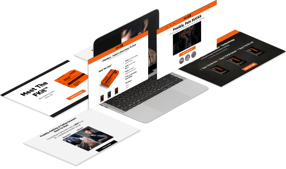
FranklyNumb™ needed a complete visual identity and e-commerce experience for a tattoo numbing product entering the market with a bold, memorable personality. I created the brand system, Shopify website design, product packaging direction, social advertising graphics, merchandise concepts, and developer handoff materials so the brand could launch with a consistent look across product, web, and promotional touchpoints.
My Role:
Lead Designer — Brand Identity, E-Commerce U.I., Packaging & Launch Assets
Responsibilities:
Brand Identity • E-Commerce User Interface • Product & Packaging Design • Campaign Assets • Design Handoff
Deliverables:
- Brand identity system
- Logo design
- Color palette
- Typography system
- Brand guide
- Shopify website design
- Product page design
- Mobile website layouts
- Product packaging design
- Product label design
- Social media graphics
- Email graphics
- Merchandise concepts
- Developer handoff files
Project Challenges
Creating a Brand From Nothing
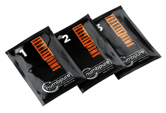
FranklyNumb™ launched without an existing brand system. While the founders knew their audience and had initial preferences, the brand needed a cohesive visual direction that could support products, packaging, e-commerce, and marketing from day one.
Adapting to Product Changes
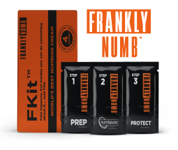
The product evolved during the FDA approval process, shifting from a single packet to a three-step system. Branding, packaging, and the website had to be updated in parallel to reflect these changes without breaking consistency or delaying launch.
Unifying Packaging, Web, and Marketing
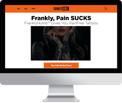
All brand assets needed to work together across physical packaging, digital storefronts, and marketing materials. Designs had to remain clear, usable, and scalable while being handed off accurately to a custom Shopify developer.
My Approach
I approached FranklyNumb™ as a full brand system rather than a single logo or website. The visual direction needed to feel bold enough for the tattoo industry while still staying clean, organized, and usable for e-commerce. I started by building the identity system, including the logo, color palette, typography, and overall visual tone. From there, I carried the same look into the Shopify website, product packaging, social graphics, email graphics, and merchandise concepts.
As the product direction evolved, the design system had to stay flexible. The original single-product concept expanded into a three-part product lineup, so the packaging and website layouts were adjusted to support multiple products while keeping the brand consistent. The final files were prepared for developer handoff so the design could be translated into a working Shopify experience.
The Process

Brand Definition
The project began with the core brand identity. I developed the logo, color palette, typography, and visual style so FranklyNumb™ had a clear foundation before the website and product materials were created.

Interface and Product Design
After the identity system was established, I designed the Shopify website layouts around the product experience. This included homepage sections, product information areas, calls to action, mobile layouts, and reusable visual elements that could support both shopping and brand storytelling.

Refinement and Handoff
The product line later shifted from one item into a three-part system, which required the packaging and website structure to be refined. I updated the product presentation, organized the supporting graphics, and prepared the design files for developer handoff.
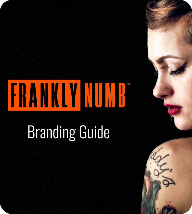
Style Guide
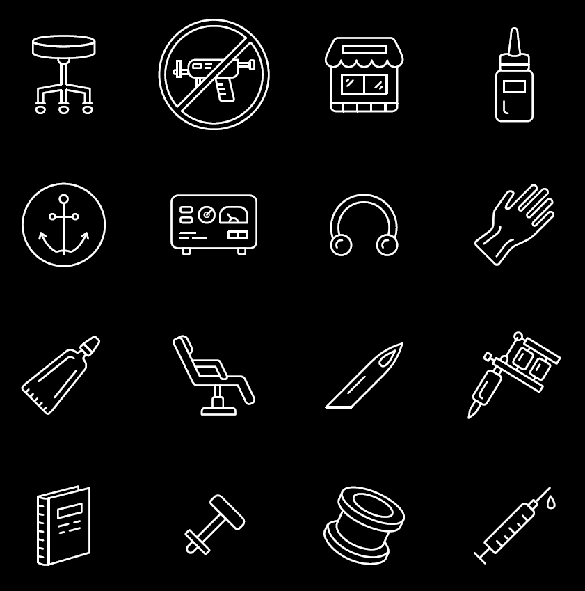
A complete brand style guide was created before development to define color, typography, spacing, icon usage, and layout rules. This established a clear visual direction and ensured consistency across packaging, the online store, merchandise, and marketing materials as the brand launched and evolved.
Color System
The color system was designed to support strong contrast, product visibility, and brand recognition across digital and physical applications, including packaging, e-commerce, and promotional assets.





Typography
Typography was selected to reflect the brand’s tone while remaining clean and readable across packaging, web, and marketing use. The system supports consistency across digital and print applications.


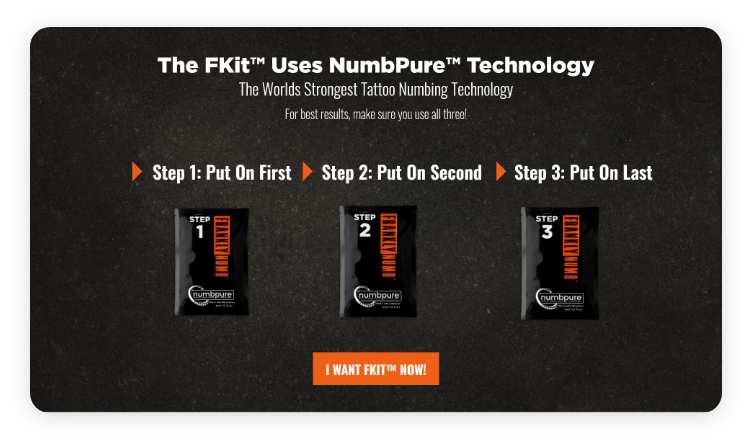
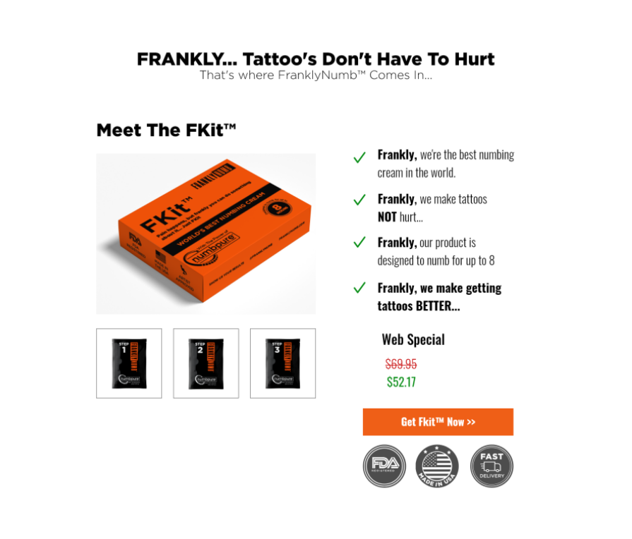
The Shopify storefront was designed for clarity and conversion, with a consistent page structure and repeatable components. Product cards, pricing blocks, step-based product visuals, and calls to action were standardized so every page felt familiar and easy to use. This system supported fast updates and scalable campaigns without breaking the brand.

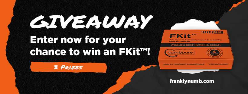
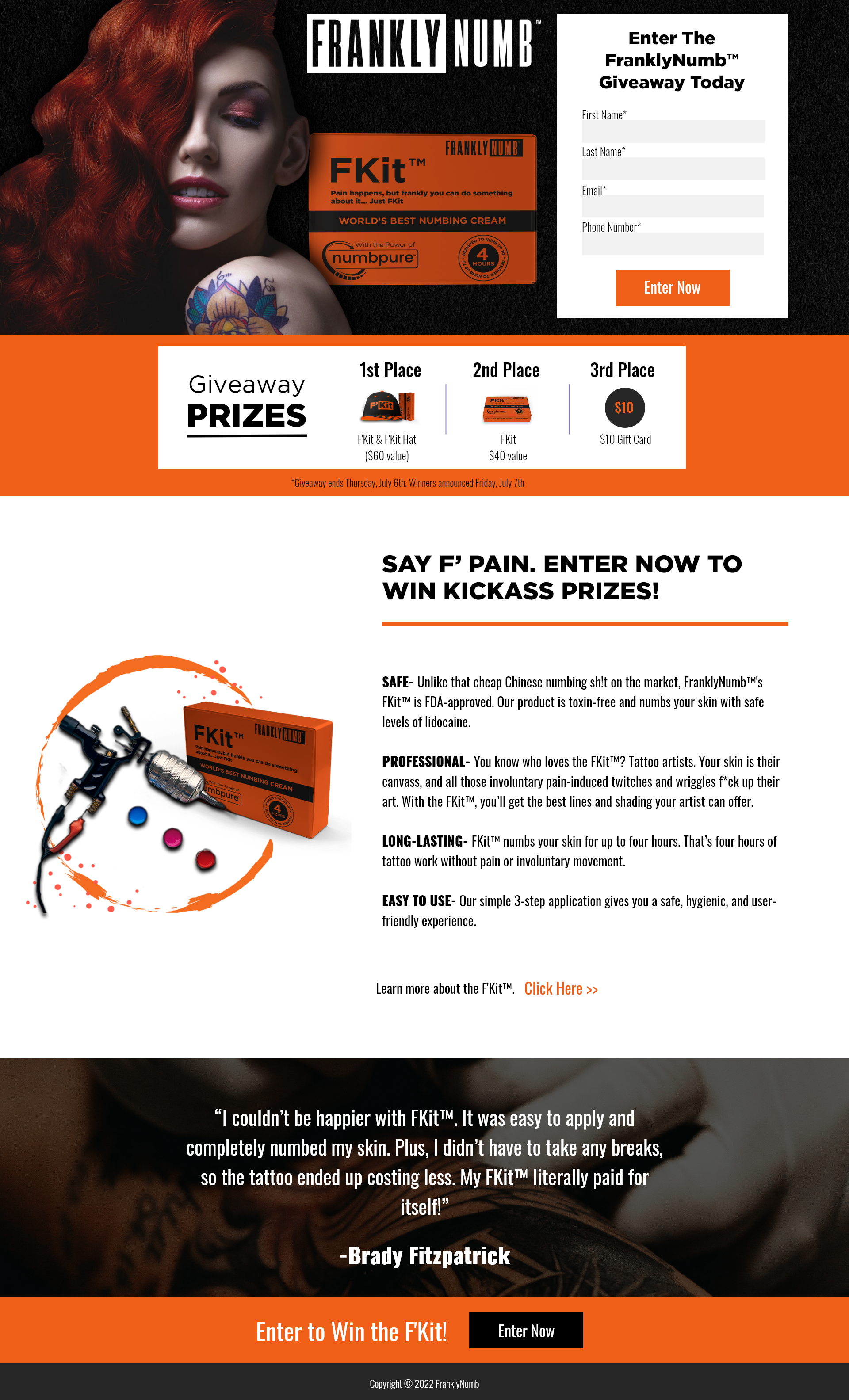
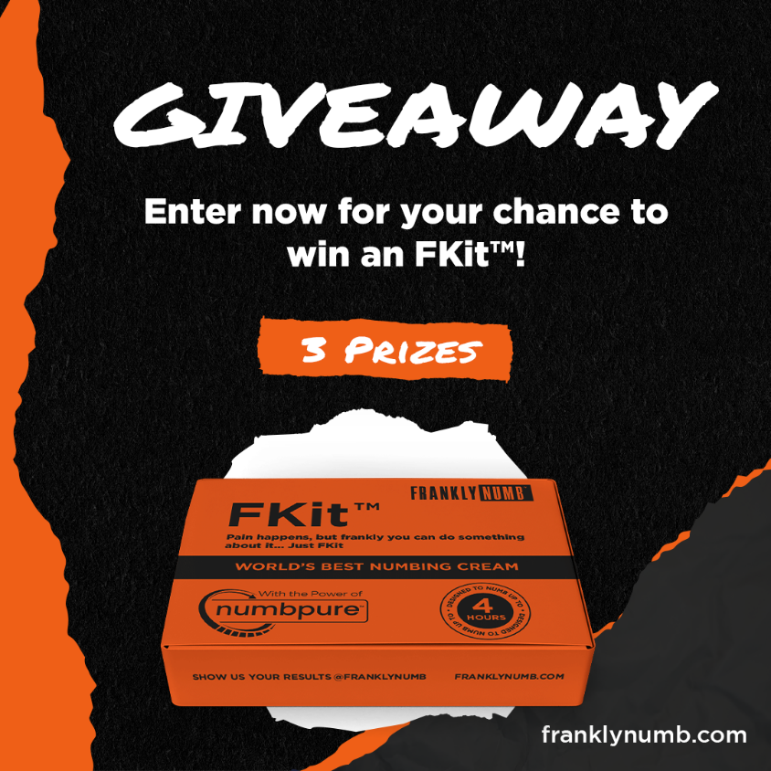
The brand system was also carried into supporting digital graphics so FranklyNumb™ could show up consistently beyond the website and packaging. I created social media, advertising, merchandise, and promotional graphics that used the same visual direction, typography, color system, and product messaging.
These pieces helped extend the brand across the launch experience without making each asset feel disconnected from the main e-commerce design.
Results
- Established a complete brand and product system where none previously existed
- Enabled the launch of the first Food and Drug Administration–approved tattoo numbing cream
- Created visual consistency across packaging, e-commerce, merchandise, and marketing assets
- Supported a transition from a single product to a multi-step system without fragmenting the brand
- Delivered a scalable design system that allowed the brand to expand products, campaigns, and merchandise